Sometimes my design strategy needs to provide all the ingredients to cook with. Sometimes it’s just a matter of adding some seasoning to work that’s already working. This project is an example of the latter.
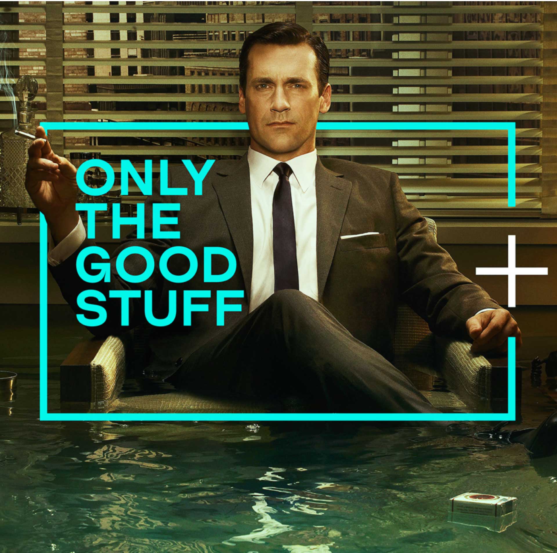
Creative agency BigSmall had already cracked the strategy for launching a new streaming service into a world full of content: ‘the world doesn’t need more. It needs better’.
And AMC+ already had a logo to which their ‘+’ could simply be added.
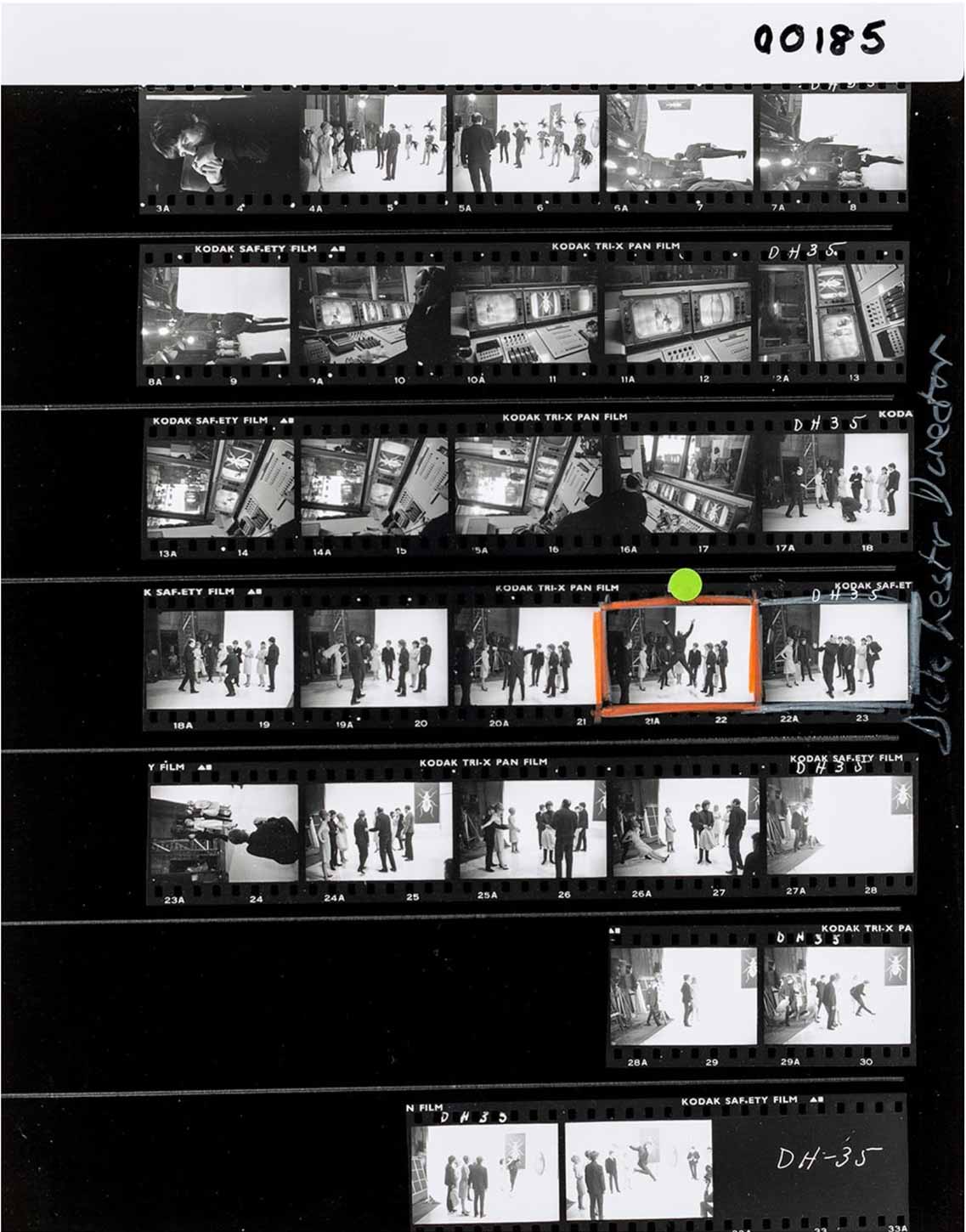
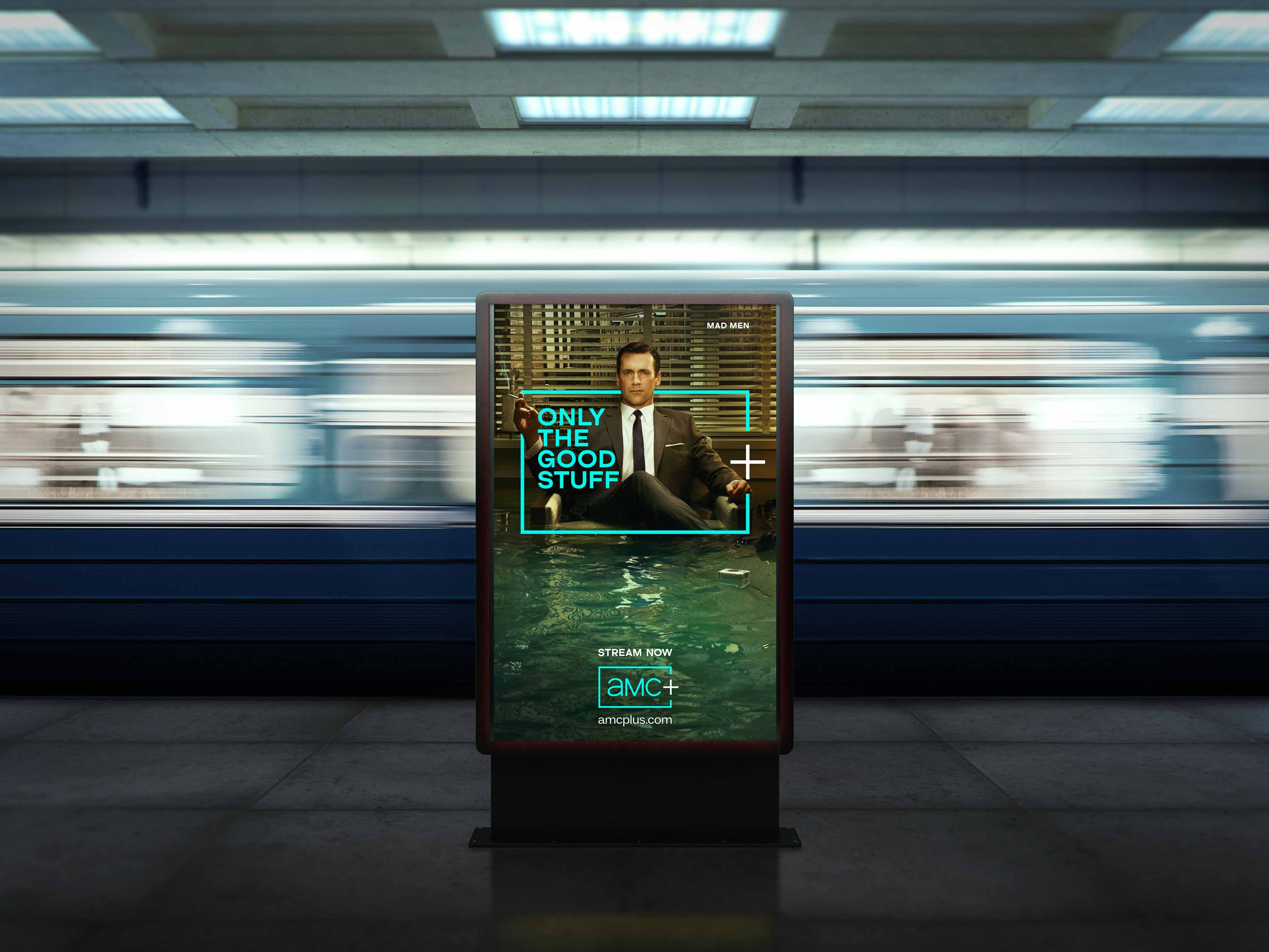
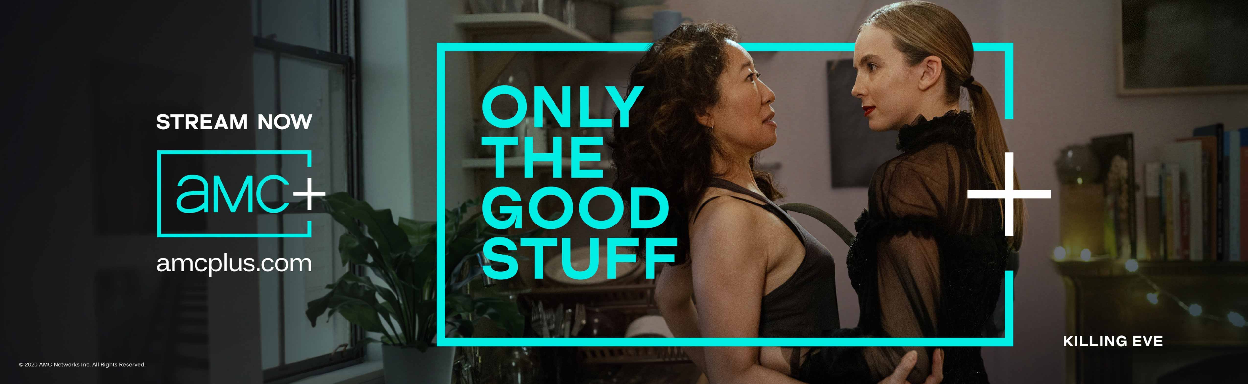
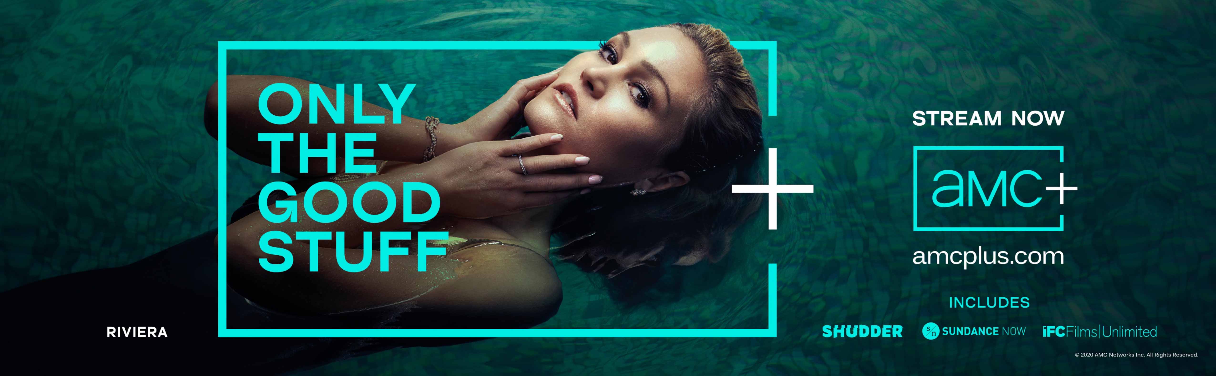
My contribution was to connect the dots graphically. If this is a streaming serivce that filters out all but ‘the good stuff’, then the identity could work much as a photographer adds cropping marks to a contact sheet (as in the example above) to fully focus on the images that pack the most punch. A simple thought that added a graphic ‘point’ to an already strong proposition.

Following the launch, AMC Networks reported better-than-expected streaming subscriber growth, ending the year with more than six million streaming subscribers, including AMC+, and exceeding its target. As a result, AMC upgraded its longer-term subscriber forecast.
- Design strategy: Silas Amos
- Agency: BigSmall
- Designer: Jonty Harbinson
- Client: AMC
Note – the copyright for the contact sheet shown belongs to Magnum. I just used it to sell in the idea.