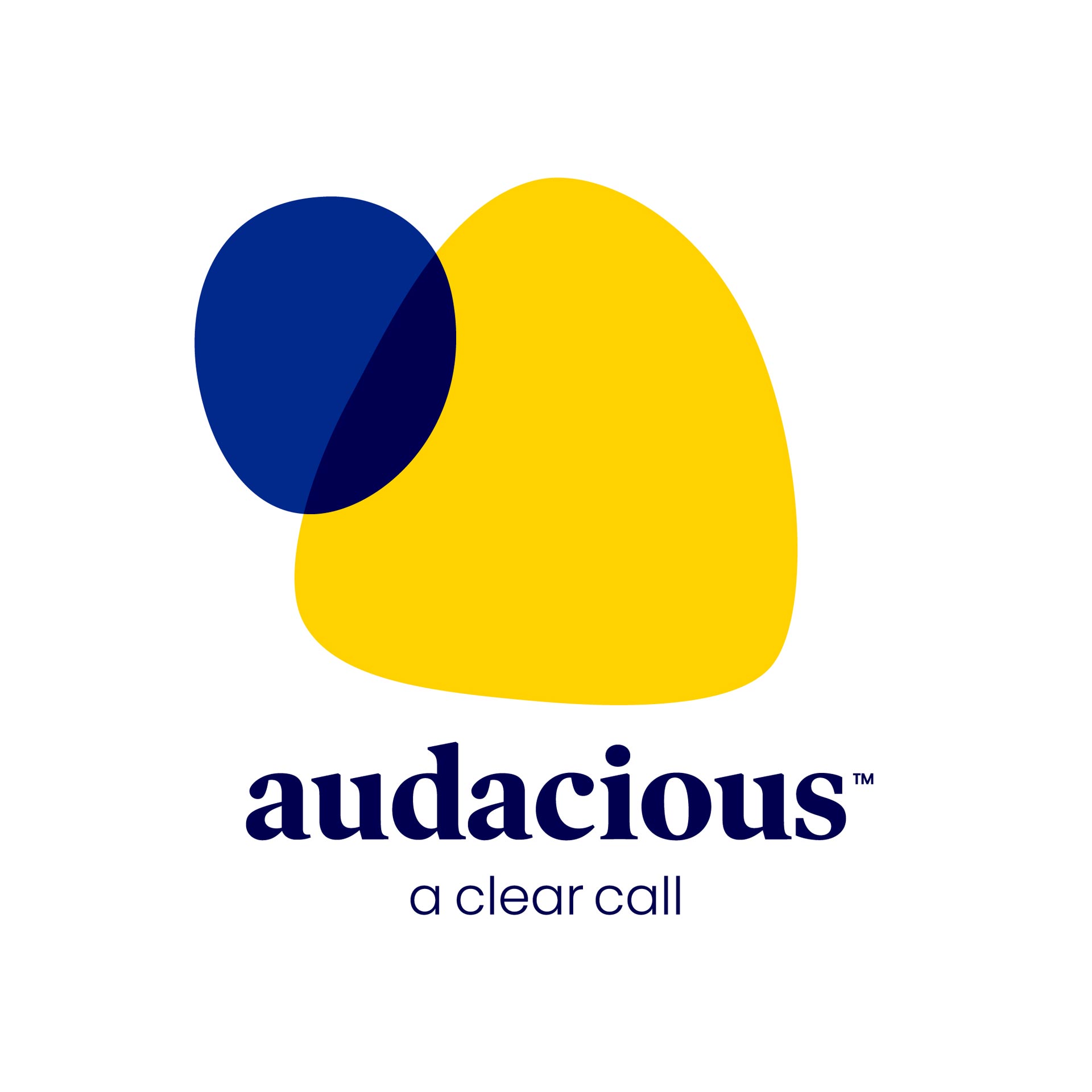
Audacious is a mobile service provider with a difference. The pitch, tone and volume of their calls are personalised to your level of hearing, so you get the clearest possible calls.
But there is a lot of social embarrassment around self-identifying as ‘hard of hearing’.
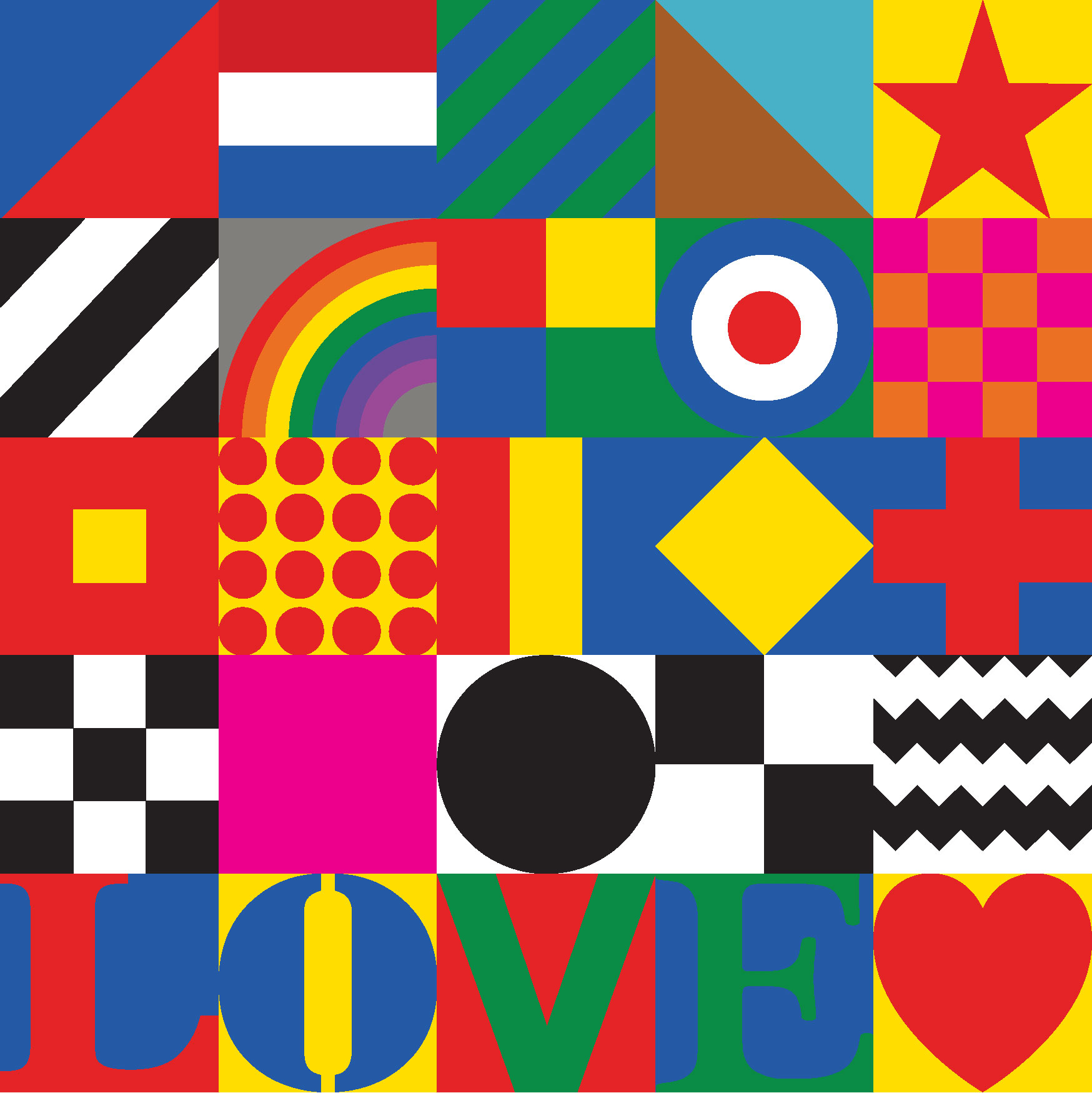
Our task for a brand that aids hearing was to create an identity that didn’t feel like a hearing aid. Rather it should look like a positive and modern mainstream choice.
Evoking ‘clear human connection’ was the design strategy we pursued, from UX and billing to their office artwork.
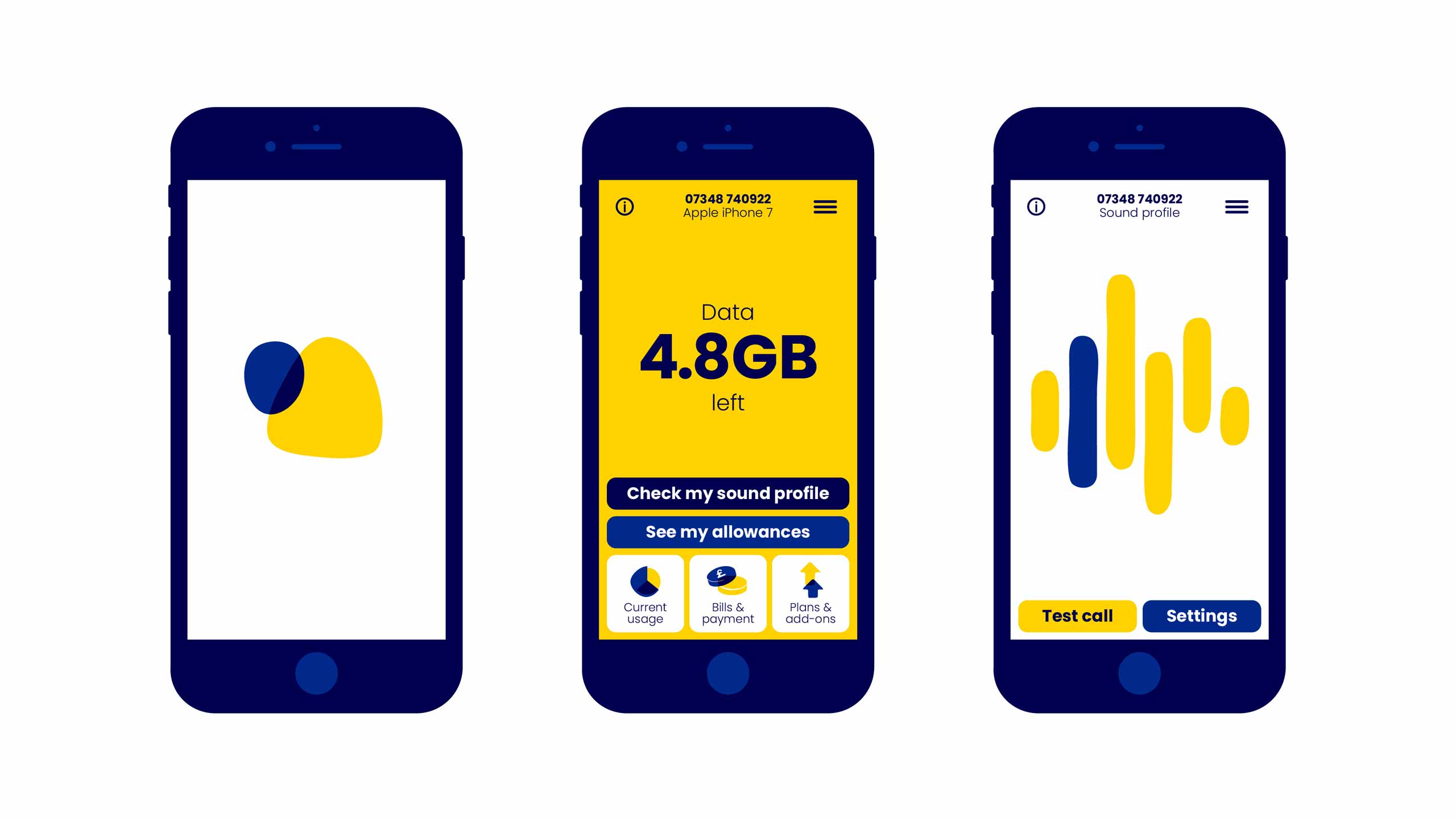

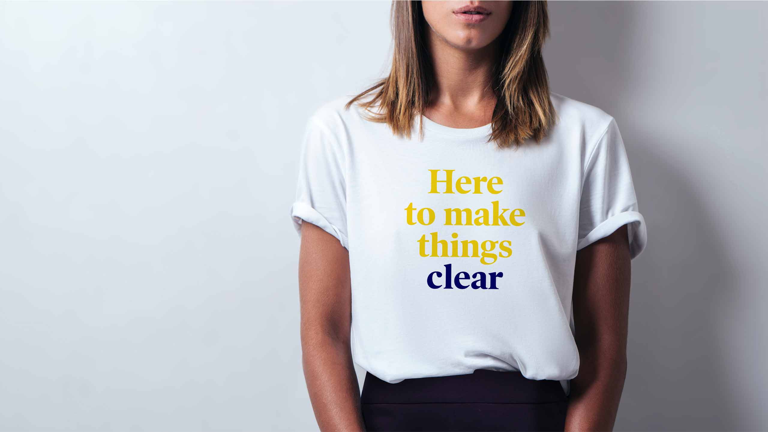
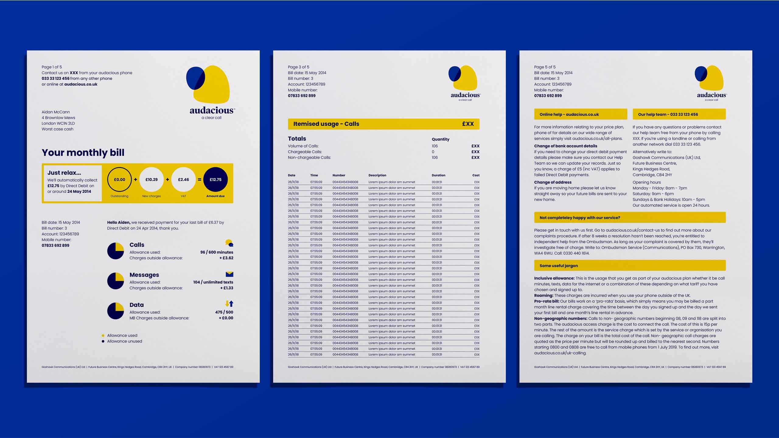
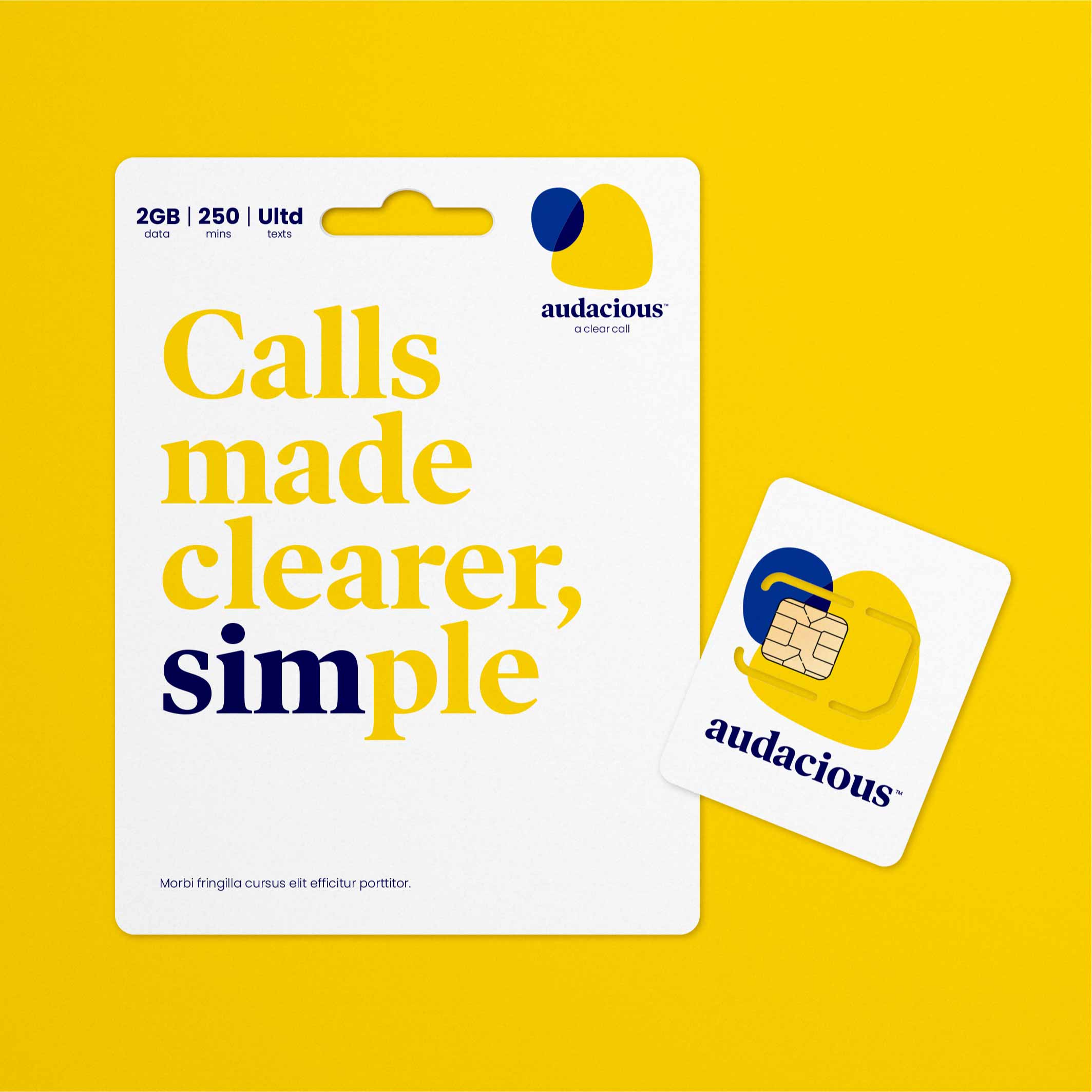
The design aimed to create a bold positive and inclusive tone that is mainstream in the best possible way. The colours contrast to a AAA rating making it also visually inclusive.
Online conversion doubled in three months, with strong PR and industry interest sustained beyond launch. In testing it was found that more exposure to the branding significantly increased consumer response.
“Silas delivered a strong and distinct brand identity which consistently receives broad acclaim, as well as strategic planning of brand purpose and a 360-comms platform.”
– Nick Rawlings, Audacious brand manager
- Design Strategy and concept: Silas Amos Ltd.
- Design Partner: Derek and Eric.